To visualize the relationship between calories available in a given place and calories consumed by the local population, we developed a simple three-column graph. If used on a country-by-country level, our graph is very similar to calculations made by the FAO based on Food Balance Sheets every year. However, because country-wide averages do not always depict where there are large populations of hungry people, we hope to use this graphing system to analyze local conditions rather than food availability across a nation.
The graph consists of three related bars measured in calories per person per day. The first is the overall supply of calories per person per day in the area in question. If we analyze an entire country, then this number can be the national caloric supply derived from FAO’s Food Balance Sheets. The second column is the number of calories required for an average person to live. We hold this number at 2100 calories per day, although naturally there is some variation between individuals. Nutritionists regard 2100 calories as the minimum number of calories to maintain a healthy, active lifestyle (Bassett & Winter-Nelson, 2010). The third column in our graph is the average calories consumed by a person in the specified area; this is by far the hardest quantity to measure on a large scale, although local surveys have been able to gather small amounts of data.
This system allows us to see certain key relationships between the supply and demand in a region. If the national supply per person is less than the required calories per person, then we predict there to be major hunger problems in that area. If the difference between the received calories per person and the national supply per person is large, we can conclude that resources or wealth are distributed unequally in the region. Finally, if we can estimate the way a particular policy will affect one or more of the measures on the graph, we can estimate the effect it will have on the hunger in the region.
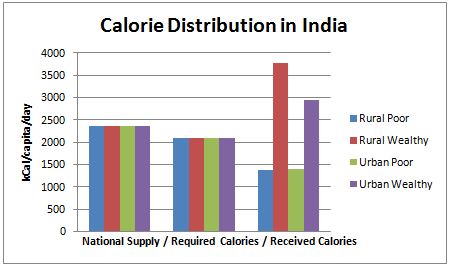
The calorie distribution among different demographic groups in India is a good example of the utility of this tool. The graph below shows that the national calorie supply per person in India is higher than the required calories per person. Nonetheless, the graph shows that the poorest groups of society only receive a fraction of their daily calories. We can conclude from the apparent difference between the caloric intakes of the wealthy and the poor that a certain degree of inequity exists in India.
Data retrieved from: http://faostat.fao.org/ and Mehta, 2003.
Food and Agricultural Organization. (2007). Food Balance Sheets. Retrieved November 22, 2010, from http://faostat.fao.org/
Mehta, J. (2003). Poverty in India. Retrieved November 22, 2010, from http://www.saunalahti.fi/otammile/povindia.htm
Bassett, T. & Winter-Nelson, A. (2010). Atlas of world hunger. Chicago: The University of Chicago Press.